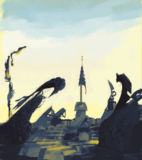
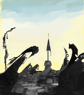
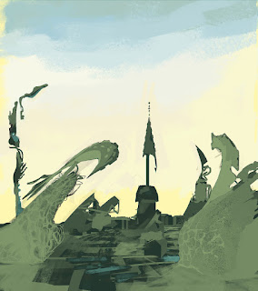
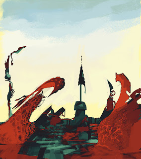
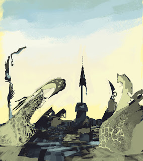
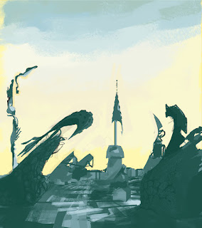
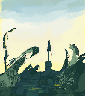
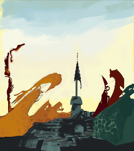
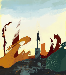
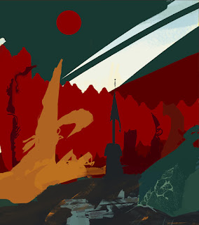
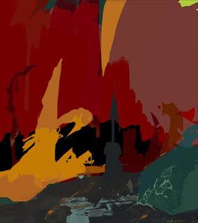
Yesterday I tried messing around with colour gradients, and tried out select colour application using masking layers.
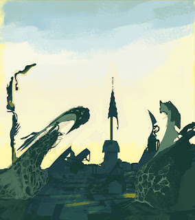
This is an alternative option from leaving the buildings black and white, though the latter might have a less distracting contrast.
All the following colours were directly referenced from Ernst's own paintings.
 |
| 1 |
 |
| 2 |
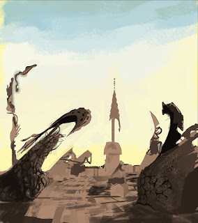
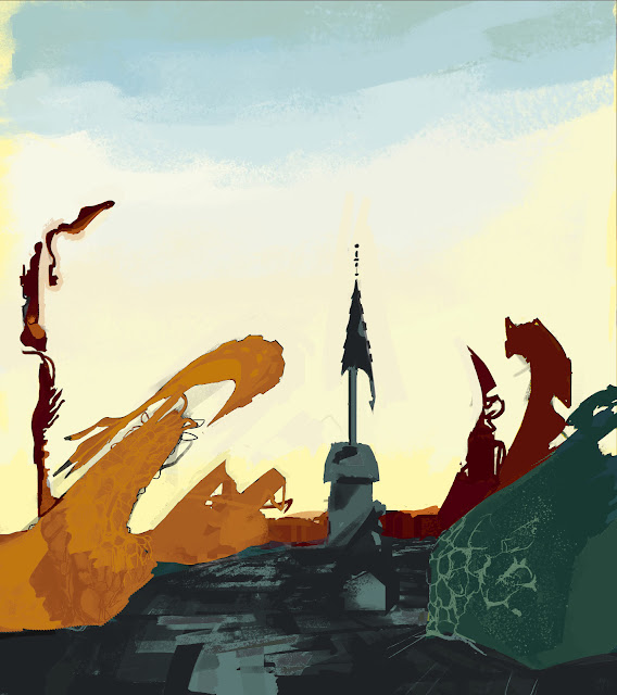
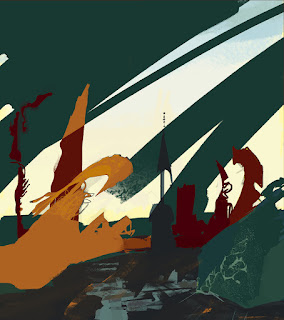
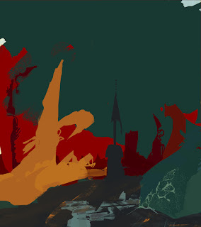
It's getting that balance in aerial perspective, something you often find when looking out from a high distance across a vast range. You find the more distant buildings are fainter, less detailed, and have less tonal variation.
 |
| 3 |
 |
| 4 |
 |
| 5 |
 |
| 6 |
 |
| 7 |
 |
| 8 |
 |
| 9 |
 |
| 10 |
 |
| 11 |
 |
| 12 |
 |
| 13 |
 |
| 14 |
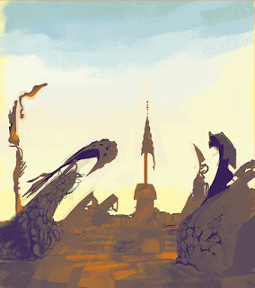
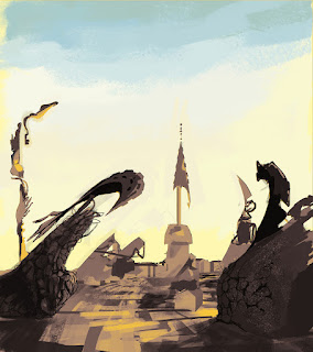
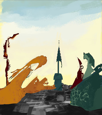
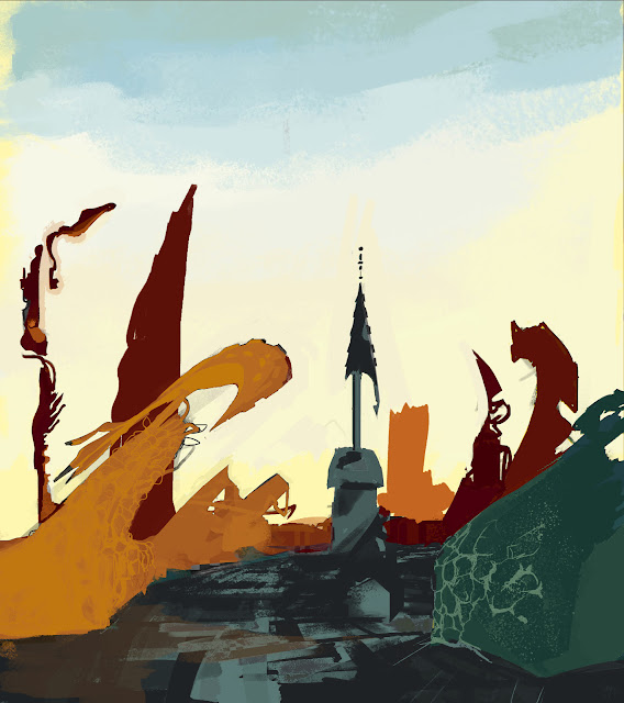
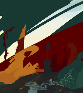
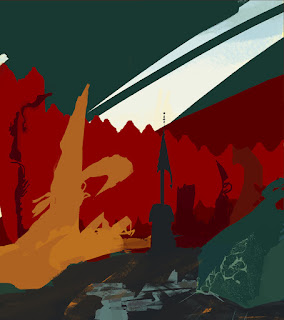
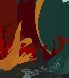
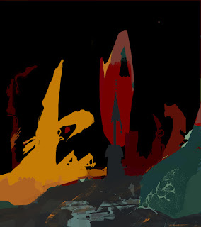
At this point I started making copies of the gradient mask and separating each of the buildings, similar to 'Europe after the Rain II'.
 |
| 15 |
 |
| 16 |
 |
| 17 |
 |
| 18 |
 |
| 19-i |
 |
| 19-ii |
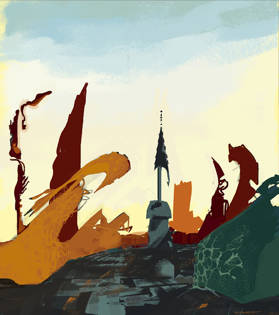
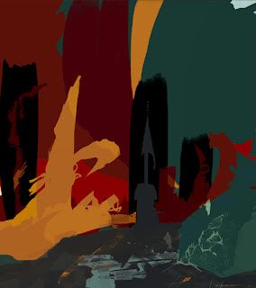
I need to work a little longer on the blending, so the buildings all seem to link together despite being of different colours.
 |
| 20-i |
 |
| 20-ii |
 |
| 21 |
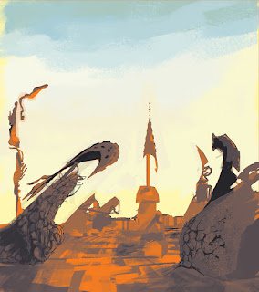
It was at this point I wondered if there was another way of showing the fact these buildings are intangible things. Lost in the real world, as a consequence of war.
Ernst is known to take away from his paintings (scraping off the oil in his 'Grattage' work).
In the actual final model I was considering using 'Opacity' in maya as a means of showing this technique. Additionally having textures in the form of Frottage work, on top of the 'dead coral' shapes you can see drawn in the main buildings. This texture will replicate that dotted, dimpled effect you'd see on rocks and dried up coral hopefully.
 |
| 22 |
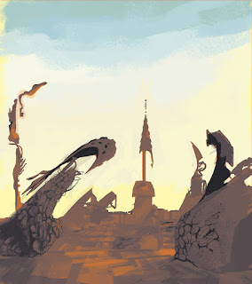
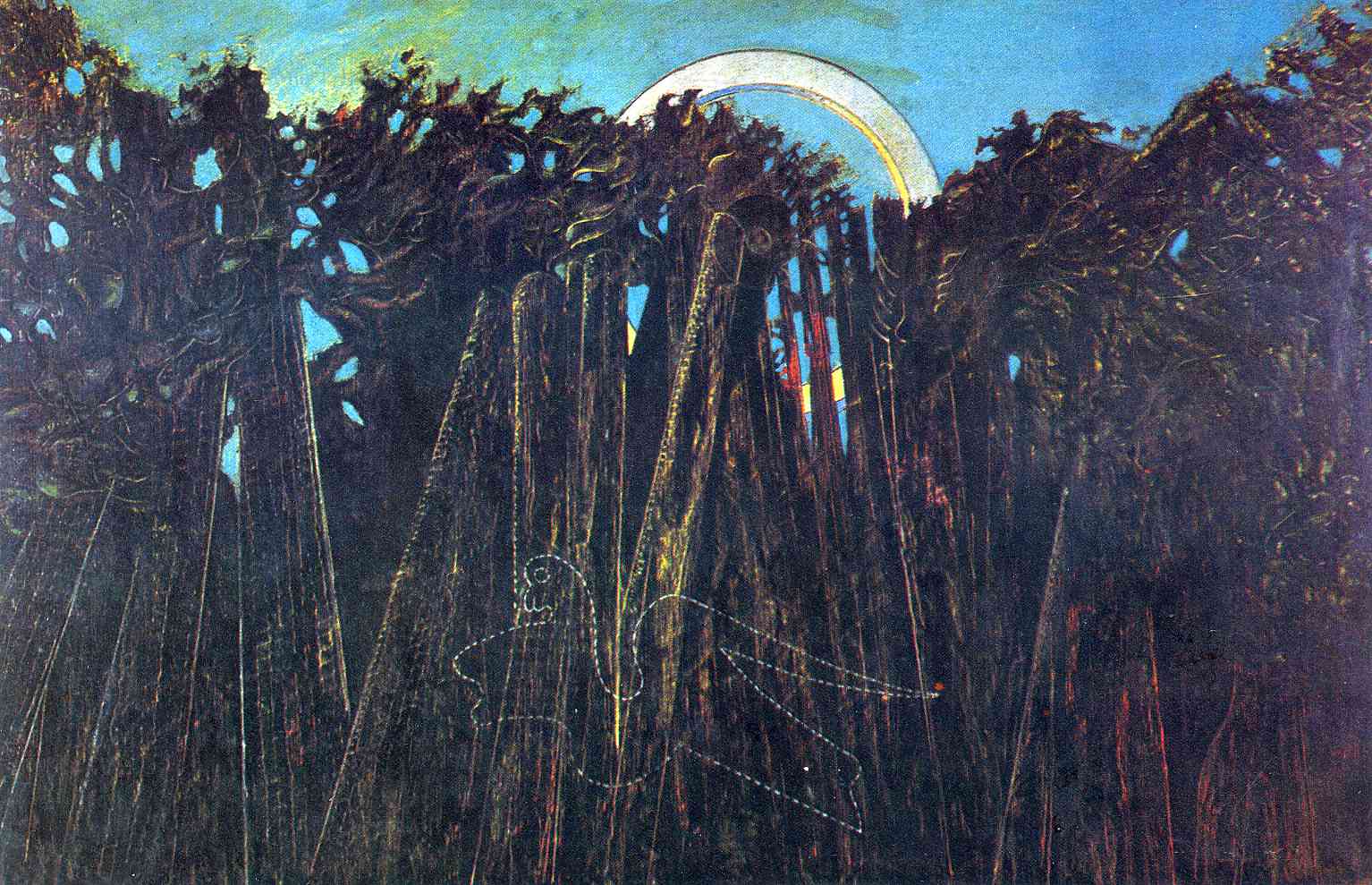
It's at this point I got a tad ahead of myself, and experimented in Photoshop to make the buildings seem less 'whole' and almost like they're floating, as you see in some of his work here:
Note how the subjects appear almost like they're floating in that space.
Also, notice how they're all disjointed, yet curve around each other all the same. It's almost wave-like.
 |
| 23 |
 |
| 24 |
 |
| 25 |
 |
| 26 |
 |
| 27 |
 |
| 28 |
 |
| 29 |
 |
| 30 |
References
-


Hey Rachael - don't forget to always number your thumbnails etc - it makes feedback so much easier - of me, the 7th drawing from the top - with the strong reds - is great!
ReplyDeleteI've added the numbers, thanks for the feedback. Also I agree, the reds do make the image look a lot stronger!
Delete