CG Artist Toolkit- Character: Concept Design Part 2
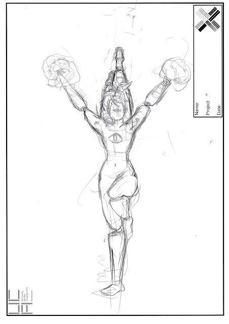
As continued from the initial concept drawings, we'd started yesterday to experiment with colouring and finalising our monster inc. characters.
The chosen image was scanned into the computer, and opened in Adobe Illustrator, where I used the 'pen tool' to outline and ink out the final design.
Before the copy, as seen below, I had had another version that I'd started applying the lines to. This copy didn't work too well, naturally since this was my first time using this tool (it was tricky to get the hang of, but once more familiarised it should become second nature. Moreover, Illustrator was useful at zooming in and allows minuscule detail at high quality to be edited, which is something that at times can't be achieved on other programs).
So, with the second copy I restarted the design again.
Below are the stages I went through to achieve the final image:

 |
| Line- Layer 2 |
 |
| Chosen colour palette- layer 1. |
Layer 2's visibility is re-selected alongside the original.
Layer number 3 was made for the shadows. By selecting the 'meatball', the 'Window Tab' and then the 'Appearance' option, you can alter the opacity to the 'darken' option, (and, if preferable, adjust the strength accordingly), and draw using the 'pen tool' again where you feel the shadows ought to be. You tend to use a darkish grey for the shadows, but I myself decided to 'eye-drop' the colours of whatever I was drawing onto (as long as it wasn't multiple colours being drawn over, in which case I chose the colour of the largest area being selected).
I started with the legs, and because of the angle of the light it seemed to source would have to be coming from below. This made her incredibly sinister at times, especially when establishing the face, when I couldn't decide whether it should it be smooth, or have the curves and contours that we can recognise.
Finally the highlights were applied. This was essentially done using the same process as above, with the shadows, only the opacity is set to 'screen' instead. Her legs in the initial drawing looked almost mechanic/plastic or metal... So I tried to work with that during it's application.
I'll need to research how shadows can fall on different types of materials for future reference, and find out how to re-adjust the drawn line after it's been established.
Overall, this technique as a whole needs to be worked on.
However, I'm glad I learnt what I have, and I'm sure with time it'll be something I can resort to a lot (particularly during the pre-production stages of a project).
It's a start.


Comments
Post a Comment